Uber's Autonomous Visualization System: An InfoVis perspective
In February, Uber announced on their engineering blog that they were:
“excited to open source the redesigned and expanded Autonomous Visualization System (AVS), a new way for the industry to understand and share its data … With AVS abstracting visualization, developers can focus on core autonomy capabilities”.
The story was quickly picked up by The Verge and VentureBeat, followed by some shares on Reddit and Twitter.
Their AVS system is visually stunning. It looks like the kind of futuristic interface you’d expect to see in a blockbuster movie. You can try out Uber’s live demo here.
But, looking back 4 months on, does AVS really hold up to its ambition to become the new visualization standard?
Claim: Visual Comparisons
Uber’s blog post claimed that future developments would include “richer features such as side-by-side comparisons” to examine the effects of autonomous vehicle hardware and software improvements. Here’s the example they provided:
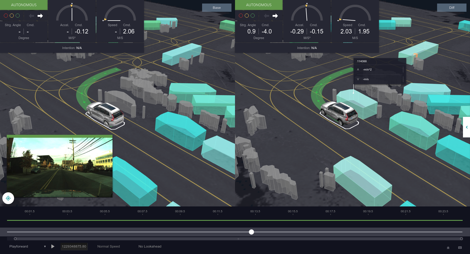
Visually stunning. But does the visualisation actually help notice differences between the two scenarios? It’s obvious once you see it, but due to the clutter, it took me almost a full minute before I finally spotted the difference. (Image from Uber’s original blog post)
It’s tempting to try to display all the available information in a single visualisation. I’m guilty of this too. However, due to limits of human perception, it’s often better to provide lots of simple visualisations in which features stand out, rather than trying to display everything on one big complex visualisation that users have to visually scan to find the information they are after. This is the principle behind small multiple visualisations, as well as the inspiration behind University of Washington’s VizDeck system that allows the user to create task-specific dashboards by picking out useful vizlets from thumbnails.
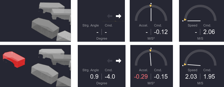
Proposed change: Multiple simple visualisations, each showing a single feature, would make relevant information more salient.
Claim: Declarative Visualisation
Uber’s blog post claimed a “declarative user interface display system.” Keen to see how they mapped data to visuals, I began reading through their documentation, and found this code snippet:
export function loadLidarData(data) {
  const binary = readBinaryData(data);
  const float = new Float32Array(binary);
  const size = Math.round(binary.length / 4);

  const positions = new Float32Array(3 * size);
  const colors = new Uint8Array(4 * size).fill(255);

  for (let i = 0; i < size; i++) {
    positions[i * 3 + 0] = float[i * 4 + 0];
    positions[i * 3 + 1] = float[i * 4 + 1];
    positions[i * 3 + 2] = float[i * 4 + 2];

    const reflectance = Math.min(float[i * 4 + 3], 3);
    colors[i * 4 + 0] = 80 + reflectance * 80;
    colors[i * 4 + 1] = 80 + reflectance * 80;
    colors[i * 4 + 2] = 80 + reflectance * 60;
  }
  return {positions, colors};
}
That doesn’t look declarative! The lidar (laser scanner) sensor can only measure position and reflectance, not colour. So to load lidar data into the system, engineers have to write a for loop that converts each of the lidar points to a grey dot to match Uber’s standard.
This is sub-ideal for multiple reasons. Firstly, using 3 colour channels to encode a single information channel wastes computational resources. But from an visualisation perspective, it is also wasteful of visual design space and precludes a lot of interesting possibilities, such as letting the end user chose the visual mapping. Uber provides a declarative means of specifying what panels appear in the UI, and provides some CSS-like styling features, but the mapping of data to visual attributes is mostly done using imperative code.

Proposed change: Let the end user dynamically remap data to visual attributes based on their needs.
Claim: Industry contribution
Back in February, Uber’s hope was that “by open sourcing it to the industry, we encourage more to contribute and build upon this initial set of ideas.”
4 months on there are only 8 developers who have committed more than 50 lines of code to the project. Looking through their profiles, it seems that all 8 of these developers work for Uber. The AVS system consists of two separate projects, XVIZ (the protocol for representing and transforming data) and streetscape.gl (the end user interface side for presenting the data). This was meant to “enable decoupling”; however, the top 5 Uber developers for XVIZ and streetscape.gl are exactly the same set of people, thus it’s unclear if the protocol can really be considered decoupled from a project perspective, even if technically decoupled in the codebase.
In Uber’s defence, it’s possible that industry could have adopted Uber’s AVS system but chosen not to contribute back. Uber’s original blog post quotes support from the co-founder of Voyage and the CTO of Applied Intuition. There has since been some use by Foresight.ai (a small start-up of around 10 employees). Foresight.ai mention “two notable challenges” of Uber’s design that required code modifications in order adapt the tool to their use case and scale it beyond a single vehicle perspective.
In contrast to the Alan Turing Institute’s plan for automating data visualistion by creating tools such as Terascope that harness cloud-computing to render city-scale datasets, Uber’s AVS system performs all rendering on the client using WebGL, so is fundamentally limited in how many data points can be visualised.
Conclusion
AVS looks and feels awesome, and Uber’s visualisation and software teams should be congratulated on that. I’m thankful that Uber decided to contribute their code to the community under an open source licence, and expect that the codebase will provide a useful starting point for small teams looking to adapt it to build their own concept demonstrators.
However, Uber’s bold claim that by “abstracting visualization” they could “[free] developers from having to build custom visualization software for their autonomous vehicles” is inconsistent with their software design choices. Achieving this long-term vision requires re-shifting priorities towards information visualisation fundamentals over aesthetic appeal, formal data semantics over popular conventions, and scalability mechanisms over performance tweaks.
This blog post includes images from Uber’s engineering blog for purposes of criticism and research, which remain copyright © 2019 Uber Technologies, Inc. It also includes a code sample released by Uber under the terms of the Apache License, Version 2.0. My own contributions may be freely shared and reused under the terms of the Creative Commons Attribution licence